A creative blog and artist blog featuring tips on how to sell art
RSS
Crello - Amazing Tool To Create Your Own Graphics

create your own graphics with Crello


An Amazing Tool For Creating Your Own Graphics 

All artists, entrepreneurs and small-to-mid sized organizations are constantly needing graphics for posts, ads, covers, stories, ebooks and more! But are you tired of having to pay a graphic designer? Crello is an easy-to-use tool that not only helps you create graphics, but you can easily resize them for different social media and marketing needs. Crello includes a huge variety of templates, photos, objects and design ideas (and, with the pro plan, you can add your own photos and fonts).

I was able to create my first graphic within a matter of minutes. And within a couple of weeks, I was able to create my own set of branded templates to use on a regular basis. I especially love that you can also create videos, animated effects and infographics.

Get it now using my affiliate link for CRELLO (thank you for using it!) for only $49 LIFETIME. This is a HUGE savings for a product that is a replacement for Canva. [Disclosure: I only promote products I’ve tried and use or love!]

 
Posted in marketing help for artists | View Post
Content creation comes before CTA creation

Fancy CTAs Won't Work Unless You First Create Compelling Content

I read an an interesting white paper about writing compelling Calls-To-Action (CTAs). You know, those little blurbs that say "you'll lose this offer forever if you don't click now". A good CTA is critical. You want and need people to click on your content.

It sounds simple, right? All you need to do is infuse your social media with captivating CTAs and you're golden. Well, as with everything in marketing .. it's not that simple.
 
The "challenge" with marketing is, for it to work, you have to create an "ecosystem" of various moving parts. Good CTAs are just one of the many, many moving parts.

So let's take a closer look:
 
The likelihood of someone clicking, for example to request content, is directly relevant to the likelihood that they will engage in that category of content. Bear in mind, if someone doesn't engage, it doesn't necessarily mean they aren't interested, there are other reasons why engagement may be low. Take financial and investment information, a type of information that - according to research - has very low engagement.  In reality it may not be that people have little interest in learning about financials and investments online, but more that they are afraid and overwhelmed by financial investment information.

On the flip side, the top topics that people engage in are food, fashion and pets. EASY topics to grasp. No one is afraid of buying a can of soup online. But, the bottom topics that people engage in are finance, real estate and marketing. These are HARD topics, i.e., people often feel clueless about understanding them. They may be "interested" but they fear believing or trusting information from an unknown source. There is more risk involved.
 
So it's absolutely correct that CTAs are important in getting conversions. BUT, that oversimplifies it. You can't even have a CTA if you don't first have compelling content that you can write a CTA about -- and THAT's the hard part.

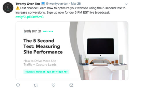
Look at the CTA in this example. This gives the impression that coming up with the CTA is fairly simple ...

example of a Call-To-Action

... but the hard part is everything that goes behind the CTA:
- The creation of a 5-second test
- The creation of a live broadcast (who will speak, what will they say, who will followup, etc.)
- The creation of the forms so people can sign up
- The creation of the graphic used in the social media
- The promotion of this graphic in social media, email, etc.
 
Wow, there's a lot more than meets the eye when you read a CTA!
 
So - as an artist - here are your challenges:
  • What content can you produce that will resonate with your audience? Keep in mind that people like STORIES. Don't just throw information at your constituents. Think about what "stories" they want to hear.
  • What kinds of information do people want? What will make them click the "get this" or "go here" button? People like checklists ... how about "10 Things to Ask Before you Buy a [insert your type of work]". You can also think about promotional CTAs such as "Buy today and get a discount". These are easy things that people CAN grasp and just may be the motivation they need to click that all important CTA button!
Lastly, don't forget, before you start writing CTAs, the first step in your marketing ecosystem is building the infrastructure: website, social media, email lists, content, etc. After that's built, you can get into the strategic stuff on how to get more folks to come to your website and convert using CTAs.
Written by Katharine Coles 010920

 
Posted in marketing help for artists | View Post
Trademark and Registration of Name and Logo for Artists

Trademark and Registration of Name, Logo and Tagline for Artists

A common question we hear - especially when talking to artists just launching their business - is whether they need to register and/or trademark their name or logo.

Each situation is unique, so no one answer works for everyone (and we certainly recommend you seek legal assistance if you are unsure), but in most cases, the answer is NO.

In our experience, unless you are investing thousands or millions of dollars into a name, logo or product, you don't usually need legal protection. In an effort to be safe, not sorry, we also recommend:
  • Don't use a name that someone else is using, particularly if they are in the same country, UNLESS it is a completely different industry. For example, if you name your business "TreeTop Design" and you sell prints, you generally have no legal liability because someone else named their business "TreeTop Design" and they sell tree forts. Generally, there is no legal liability if businesses are in completely different industries.
  • It is best, after you come up with a name, to search on the internet and see if anyone else is using it. If they're in your same industry, we recommend you don't use it. It is also best to find a name that ALSO has the URL available. That can be very tough these days, but we've found it is worth it to come up with a variation on the name that does have the URL available. You can also do a trademark search using the federal trademark database (it's free!).
Beyond that, here are a few other things you should be aware of: 
  1. In the U.S., it is illegal to use the ®  symbol unless you have actually registered your name and/or logo. That is because it is a legal designation associated with the U.S. Patent and Trademark office.
  2. On the other hand, the trademark ™ symbol has NO legal meaning, so anyone can use it. You may want to use this symbol if you have plans to register your name, logo, product, etc. 
  3. If you do decide to use the ™ symbol, it is typically placed in the top right corner. If that doesn't work, it can be moved to the bottom right corner.
  4. In printed materials or content where the logo appears more than once, you should use the version with the  ™  ONLY the first time. Using it multiple times in materials tends to make it look cluttered and it's not necessary for it to be displayed multiple times.
If you'd like to read more, here are a few helpful articles:
Written by Katharine Coles 010520
 
View Post
Artist Bio Page and What Should Be Included

Why Artists Need a Website Bio Page and What It Should Include

Maybe you're modest and you don't want to "brag" about your qualifications. Maybe you're too busy doing your art and you just don't have time. OR maybe you just don't know what to include on the page.

Most importantly - especially with scams and spam online - you want people to know that you are a real, legit artist or artisan. You are not only competing against "real" artists, but also against people that cheaply copy art and other products they find online and then sell them as your own. But in many cases, those vendors are faceless. People feel better about buying from people and organizations that they know have "real" people running them.
 
So, by including a bio page, you become more "legit"! Now that you've decided to put a "face" on the organization, what should you include on the page?

Let's be creative and tear apart pre-conceived notions. A bio page doesn't really have to be a "bio" page chock full of boring details about you and your work. It should:
  • Speak to the heart
  • Including interesting facts
  • Tell a compelling store
  • Give people reasons WHY they should buy your work
Here's what we recommend:
  1. A photo that is large enough that visitors can see what you look like (approximately 375 x 475 pixels).
  2. Basic facts such as where you live, what mediums you work in, and anything else you think other people would find particularly interesting.
  3. A very short bio, no more than 150 words, describing your general background.
  4. If you are a very expensive or credentialed artist, you should also include qualifications, showings, etc. In other words, anything that gives you credibility. That is critical if you are asking high dollar amounts for your work. 
  5. An "artist statement" or story. This is the part that speaks to and from the heart. And this is the part of the page that can really help sell your work. It should include if you've overcome great obstacles in your life, or lived with disease or pain, or were inspired by a special person or message, or created a new, unique way of doing something that no one else does. In this statement, you want to convey to the audience what is special about you and about your work. If you can do that, then people will be moved and they will want to buy your work.
For a sample of an artist or bio page, visit Josephine's Bio Page.
If you're an artist that needs help with art marketing, visit our Artist Marketing Resources page.
Written by Katharine Coles 010420

 
Posted in marketing help for artists | View Post